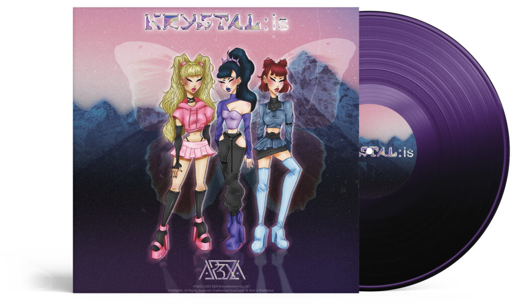
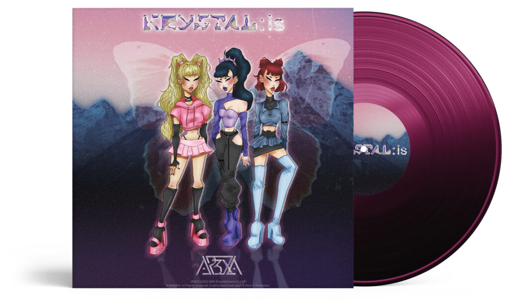
APEXA is the future of K-Pop. As a fictitious, illustrated K-Pop trio (think Gorillaz-esque), they defy what defines modern music as it stands today.
This passion-project contains an overarching variety of projects.
Starting out with the branding, the APEXA logo was designed first, then the project evolved into creating promotional materials.
Influenced by groups such as STAYC and æspa, APEXA aims to evoke a sense of nostalgia while thrusting you into the future of K-Pop.
THE INSPO
APEXA is the epitome of where the future of K-Pop is leading to.
With more and more groups leaning into technology, sci-fi concepts, and retro futurism – APEXA combines all of these concepts into a fun, and exciting package.
The three members – Eunji, Lumi, and U:ji all represent different concepts often portrayed by modern K-Pop girl groups.