Monster High has recently experienced a resurgence in popularity. Becoming a staple in every doll collector’s coveted collection in the 2010s, then dipping in popularity – Monster High has now reached it’s peak popularity with it’s strategic rebrand.
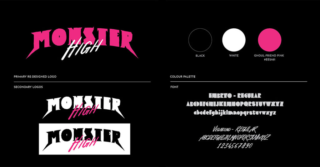
Just as the dolls have received a face-lift, it was only fitting that the wordmark, as well as the TV Intro Animation do the same.
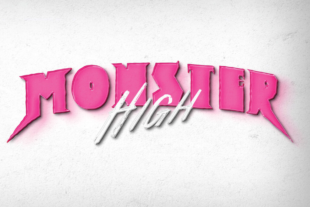
Pulling together the mature audience’s graphic aesthetic, but still appealing to the young generation – this fictitious opening credits sequence is the perfect combination of sweet and spooky.
THE INSPO
The inspiration behind the new wordmark sprouted from the idea of mashing together Monster High’s two main target audiences.
Older doll collectors, who aren’t afraid to spend big bucks on limited editon dolls.
Young kids, who want to grow up to be just like the iconic monster creatures they play with.
It was difficult to create a wordmark which could appeal to both generations – but I believe this new logo successfully achieves that goal.